Whisk_62ccfcdc2ba6a85a21249ee10add92bcdr
Updated: April 9, 2026
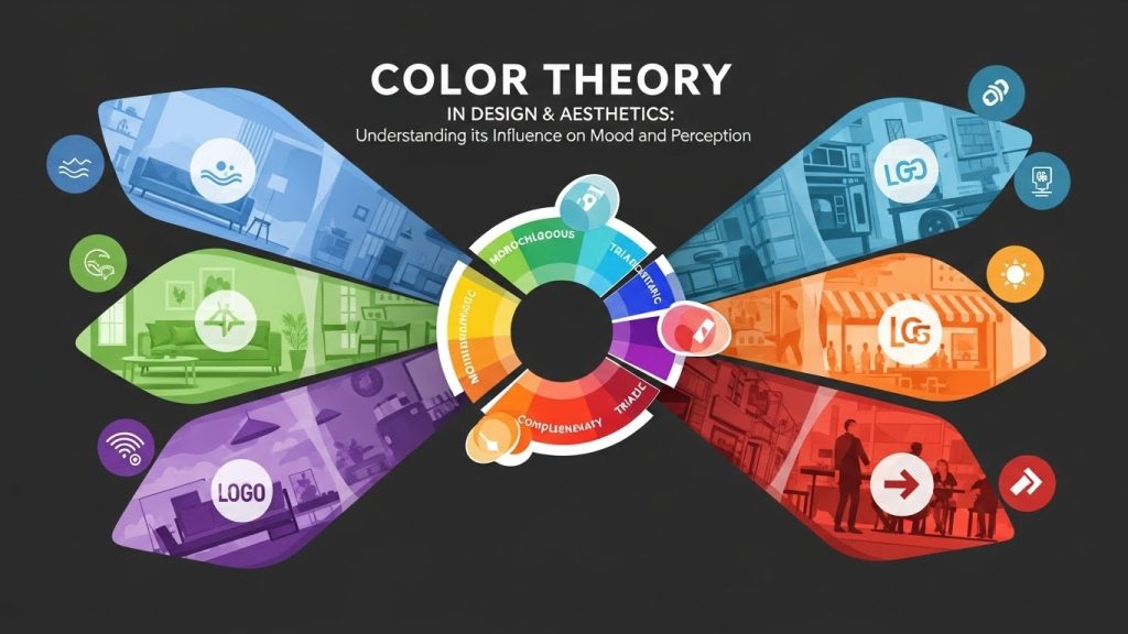
Color Theory in Design & Aesthetics: Understanding its Influence on Mood and Perception
Color theory is a crucial element in the world of design and aesthetics. It goes beyond mere decoration, influencing mood and perception in profound ways. Understanding how colors interact, influence emotions, and affect human behavior is vital for designers, marketers, and anyone involved in creative fields. This comprehensive guide delves into the intricacies of color theory, providing insights into its psychological impact and practical applications.
The Basics of Color Theory
At its core, color theory is a body of practical guidance on color mixing and the visual effects of specific color combinations. The primary colors—red, blue, and yellow—serve as the foundation, with secondary colors like green, orange, and purple arising from their combination. Tertiary colors, formed by mixing a primary and a secondary color, add further nuance.
The color wheel is an essential tool for understanding these relationships. It visually represents the spectrum and helps designers predict how colors can be paired harmoniously. Color harmony is an important aspect of design, ensuring that combinations are pleasing to the eye and evoke the desired emotional responses.
Psychological Impact of Colors

Colors have a psychological impact, influencing perceptions and emotions. This effect is often subconscious, making it a powerful tool for designers and marketers. Different colors can evoke different feelings and associations:
- Red: Often associated with passion, energy, and urgency, red can stimulate strong emotions. It’s frequently used in clearance sales and to create a sense of urgency.
- Blue: Known for its calming effect, blue is often used in corporate designs to convey trust and dependability. It can lower blood pressure and slow respiration.
- Green: Symbolizing nature and tranquility, green is used to promote health and relaxation. It can be found in designs related to the environment and finance.
- Yellow: Bright and optimistic, yellow can inspire cheerfulness and creativity. However, when overused, it may cause anxiety.
- Purple: Associated with luxury and creativity, purple can evoke a sense of mystery and sophistication.
Understanding these associations allows designers to create environments and products that resonate with the intended audience, enhancing user experience and engagement.
Color Theory in Branding and Marketing
In branding and marketing, color choice is critical. Brands use colors strategically to convey their values and connect with their audience on an emotional level. For example, color psychology plays a significant role in consumer purchasing decisions, with colors influencing up to 85% of the reason why people decide to buy a particular product.
Consider how blue is used by companies like Facebook, Twitter, and LinkedIn to convey professionalism and trust. On the other hand, brands like McDonald’s and Coca-Cola use red to capture attention and inspire excitement and appetite.
Designers must be aware of cultural differences in color perception. While white symbolizes purity in Western cultures, it can represent mourning in some Eastern societies. These nuances can significantly impact international branding and marketing strategies.
Color Schemes and Their Applications
Color schemes are combinations of colors selected based on their relationships within the color wheel. They play a crucial role in design aesthetics, offering various ways to achieve visual harmony and impact:
- Monochromatic: Involves variations in lightness and saturation of a single color. It creates a cohesive and calming effect, often used in minimalist designs.
- Analogous: Uses colors that are next to each other on the color wheel. This scheme is harmonious and pleasing, ideal for creating serene and comfortable designs.
- Complementary: Features colors opposite each other on the color wheel. This contrast creates a vibrant and dynamic look, useful for highlighting important elements.
- Triadic: Incorporates three colors evenly spaced around the color wheel. It offers a balanced yet vibrant palette, providing visual interest and diversity.
Choosing the right color scheme requires consideration of the project’s goals and the audience’s preferences. Tools like Adobe Color can assist designers in experimenting with different palettes and achieving the desired effect.
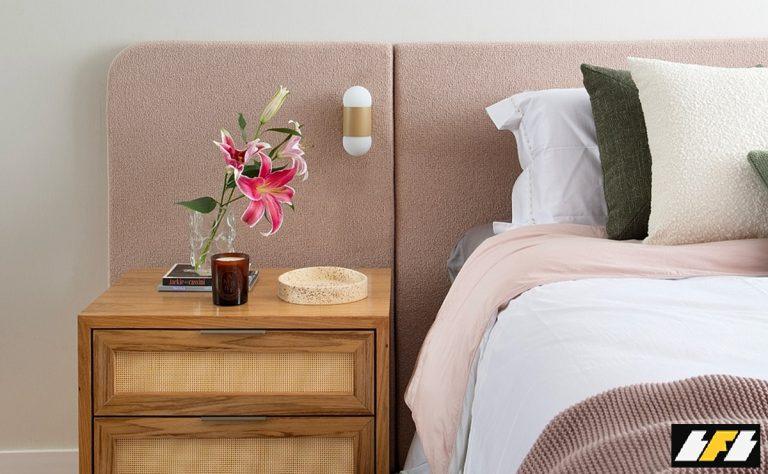
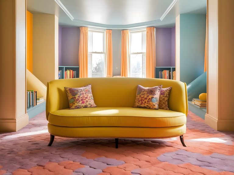
The Role of Color in Interior Design
Color is a fundamental component of interior design, influencing the mood and ambiance of a space. Designers use colors to create specific atmospheres, from calming retreats to energetic environments.
Warm colors like red, orange, and yellow can make a space feel cozy and inviting, while cool colors like blue, green, and purple can make a room feel more spacious and relaxing. Neutral colors such as beige, gray, and white provide a versatile backdrop, allowing other elements to stand out.
Lighting also plays a crucial role in how colors are perceived in interior spaces. Natural and artificial light can alter the appearance of colors, so designers must consider lighting conditions when selecting a palette.
Takeaways
Color theory is an essential aspect of design and aesthetics, influencing mood, perception, and behavior. By understanding the psychological impact of colors and how to use them effectively, designers can create compelling and meaningful experiences. Whether in branding, marketing, or interior design, the strategic use of color can enhance engagement and convey the desired message to the audience.
As you explore the world of color, remember that it’s not just about aesthetics—it’s about creating connections and evoking emotions. The power of color lies in its ability to transcend language, making it an invaluable tool for designers worldwide.
Color Accessibility and Inclusivity in Design
Incorporating color accessibility into design ensures that all individuals, including those with color vision deficiencies, can engage with and understand visual content. Approximately 8% of men and 0.5% of women globally experience some form of color blindness, which affects how they perceive different colors.
Designers can make content more accessible by considering contrast ratios, using patterns or textures in conjunction with color coding, and providing alternative text descriptions. Tools like the WebAIM Contrast Checker help designers evaluate the legibility of text and other elements against background colors.
By prioritizing inclusivity, designers not only comply with accessibility standards but also expand their audience reach, ensuring that everyone can appreciate and interact with their designs.
Exploring Cultural Significance of Colors
Colors carry diverse meanings across different cultures, often rooted in historical, religious, and societal contexts. Being aware of these cultural nuances is crucial for creating designs that resonate globally.
For example, in many Western cultures, black is associated with mourning and formality, whereas in some Eastern cultures, white is the color of mourning. In India, red is often worn by brides to symbolize purity and prosperity, while in South Africa, it can represent mourning.
Understanding these cultural significances allows designers to create culturally sensitive and appropriate content, especially when working in international markets. This consideration helps prevent misinterpretations and enhances the effectiveness of global communication strategies.
Technological Advances in Color Design
Technology continues to revolutionize color design, offering new tools and possibilities for creativity. Digital design software, augmented reality (AR), and virtual reality (VR) have expanded the ways in which designers experiment with and apply color.
Digital tools like Adobe Photoshop and Illustrator provide extensive color palettes and manipulation capabilities, allowing designers to experiment with gradients, transparency, and layering. AR and VR technologies offer immersive experiences, where users can interact with colors in a three-dimensional space, opening new avenues for design innovation.
As technology advances, the future of color design will likely involve more interactive and personalized experiences, where users can tailor visual content to their preferences, enhancing both engagement and satisfaction.
Trends in Color Design
Color trends evolve over time, influenced by cultural shifts, technological advancements, and consumer preferences. Staying informed about current trends helps designers create contemporary and relevant designs that resonate with audiences.
For instance, recent years have seen a rise in the use of pastel colors, which convey a sense of calmness and nostalgia. Bold and vibrant colors are also trending, as they capture attention and convey a sense of optimism and energy.
Environmental awareness has influenced a trend towards earthy tones, reflecting sustainability and a connection to nature. Keeping an eye on these trends allows designers to craft designs that feel modern and in tune with the zeitgeist.
Practical Tips for Designers
For those looking to incorporate color theory effectively into their designs, several practical tips can enhance the creative process:
- Experiment with different color schemes to find what best suits your project’s goals and audience.
- Consider the emotional and psychological impact of colors, aligning them with the message you want to convey.
- Test designs in different lighting conditions to ensure colors appear as intended.
- Leverage digital tools to explore various color combinations and effects.
- Stay informed about emerging color trends and incorporate them thoughtfully into your work.
By focusing on these aspects, designers can harness the power of color to create impactful and engaging visual experiences.
Final Thoughts
Color theory remains a fundamental component of design and aesthetics, shaping perceptions and influencing emotions in profound ways. From its application in branding and marketing to its role in interior design and technology-driven innovations, color continues to be a dynamic and essential element of creative expression.
Whether you’re a seasoned designer or just starting, understanding and applying color theory can elevate your work, making it more effective and memorable. As you engage with the colorful world of design, let your creativity be guided by both intuition and the principles of color theory, creating experiences that resonate deeply with your audience.