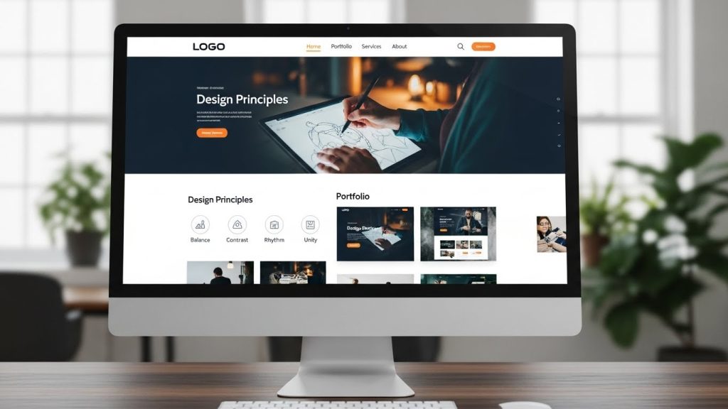
Design & Aesthetics: How to Create a Visually Appealing Website
The digital landscape is overflowing with websites, each vying for attention in a sea of competition. Creating a visually appealing website is no longer optional; it’s a necessity. An aesthetically pleasing design can captivate visitors, encourage longer site visits, and boost conversion rates. This comprehensive guide delves into the core principles and strategies to design a website that stands out and engages your audience effectively.
Understanding the Importance of Design and Aesthetics
The first impression of a website is almost always visual. Users form an opinion about a site within seconds of landing on it. A website’s design significantly impacts the perceived credibility and trustworthiness of a brand. According to a study by the Stanford Web Credibility Project, 75% of users admit to making judgments about a company’s credibility based on their website’s design.
Beyond aesthetics, a thoughtful design enhances user experience (UX). A well-designed website facilitates intuitive navigation, making it easier for users to find the information they seek. This not only improves user satisfaction but also contributes to better search engine rankings.
Key Principles of Design and Aesthetics
Creating a visually appealing website involves adhering to certain design principles that enhance both usability and aesthetics. Here are some of the key principles:
Simplicity
In design, simplicity is about minimizing distractions and focusing on core elements. A cluttered website can overwhelm users and drive them away. Embrace whitespace, and ensure every element on the page serves a purpose. For inspiration on minimalist design, check out Smashing Magazine.

Color Theory
Color is a powerful tool in web design, capable of influencing emotions and behaviors. Understanding color theory is essential to create a harmonious palette that reflects your brand’s identity and appeals to your target audience. Consider cultural implications and accessibility when selecting colors.
Typography
Typography plays a crucial role in the readability and overall aesthetic of your website. Choose fonts that are legible and align with your brand’s voice. Limit the number of fonts to maintain a cohesive look, and utilize different weights and sizes to create a visual hierarchy.
Visual Hierarchy
Visual hierarchy guides users’ eyes to the most important elements first. Use size, color, contrast, and positioning to emphasize key content and calls to action (CTAs). A well-structured hierarchy ensures that users can quickly understand the site’s purpose and navigate it effortlessly.
Implementing Effective Design Strategies
Once you understand the principles of design, the next step is to implement strategies that bring those principles to life.
Responsive Design
With the increasing use of mobile devices, a responsive design is crucial. Websites must be optimized for viewing on various screen sizes to provide a consistent user experience. Consider using a mobile-first approach, designing for smaller screens first before scaling up to larger devices. Learn more about responsive design at W3Schools.
Consistency
Consistency in design elements such as colors, fonts, and icons reinforces your brand identity. A consistent look and feel across all pages provide users with a sense of familiarity, improving navigation and usability.
Engaging Visual Content
High-quality images, videos, and graphics can significantly enhance the aesthetic appeal of your website. Visual content should be relevant and enhance the user’s understanding of the content. Use images that are optimized for web use to improve load times, and consider incorporating interactive elements to boost engagement.
Intuitive Navigation
Navigation should be intuitive and straightforward. Users should be able to find information quickly and easily without excessive clicks. Implement a logical structure with clear categories and labels. The use of a sticky navigation bar can also enhance user experience by allowing easy access to important links.
Testing and Iteration
A website is never truly finished. Regular testing and iteration are vital to maintaining a visually appealing and functional site. Conduct usability testing to gather feedback from real users and identify areas for improvement. Analyze metrics such as bounce rate and session duration to gauge the effectiveness of your design.
Stay updated with design trends and technologies to ensure your website remains modern and competitive. For ongoing learning, consider resources like Nielsen Norman Group, which offers insights into user experience research and guidelines.
Takeaways
Creating a visually appealing website is a multifaceted process that blends art with science. By understanding and applying key design principles, implementing effective strategies, and continuously testing and iterating, you can create a website that not only looks great but also delivers an exceptional user experience. Remember, your website is often the first interaction users have with your brand — make it count.
Leveraging Feedback for Continuous Improvement
Feedback is a critical component in the process of refining your website’s design and aesthetics. By actively seeking and incorporating user feedback, you can make informed decisions that enhance the overall user experience. Consider implementing feedback forms, conducting surveys, or holding focus groups to gather valuable insights from your audience.
Analyze the feedback received to identify common trends and areas of concern. Prioritize changes that will have the most significant impact on user satisfaction and engagement. For example, if users frequently mention difficulty in finding specific information, it may be time to revisit your navigation structure or content organization.
Staying Ahead with Emerging Design Trends
The world of web design is ever-evolving, with new trends and technologies emerging regularly. Staying informed about these trends can help keep your website fresh, relevant, and competitive. Here are some emerging trends to consider:
Dark Mode
Dark mode has gained popularity due to its aesthetic appeal and potential energy-saving benefits on OLED screens. It offers a striking visual contrast and can enhance readability in low-light environments. Consider providing users with an option to switch between light and dark modes based on their preferences.
Microinteractions
Microinteractions are subtle animations or design elements that provide visual feedback to users. These can include hover effects, button animations, and loading spinners. When used thoughtfully, microinteractions can enhance usability and add a delightful touch to the user experience.
Neumorphism
Neumorphism is a design trend that combines modern flat design with skeuomorphic elements. It uses soft shadows and highlights to create a 3D effect, giving interfaces a tactile quality. While still a developing style, neumorphism can add a unique aesthetic to your website when used appropriately.
Accessibility: Designing for Inclusivity
Designing an aesthetically pleasing website also involves making it accessible to all users, including those with disabilities. Accessibility should be woven into the design process from the start, ensuring that everyone can access and interact with your content.
Implement accessibility best practices, such as using alt text for images, ensuring sufficient color contrast, and providing keyboard navigation options. Consider conducting an accessibility evaluation to identify and address any potential barriers in your design.
Conclusion: Crafting a Memorable Digital Experience
Creating a visually appealing website is an ongoing journey that requires a balance of creativity, functionality, and user-centric design. By focusing on design principles, embracing emerging trends, and prioritizing accessibility, you can craft a digital experience that resonates with users and strengthens your brand’s presence online.
Remember, the ultimate goal is to create a website that not only looks beautiful but also delivers value to your users. With the right approach, your website can become a powerful tool for engagement, communication, and growth.
Utilizing Tools and Resources for Design
To achieve a stunning website design, leveraging the right tools and resources is crucial. There are numerous design tools available that cater to different aspects of the design process, from wireframing to prototyping and beyond.
Design Software and Tools
Popular design software like Adobe XD, Sketch, and Figma are excellent for creating high-fidelity designs and prototypes. These tools offer features such as collaborative design, vector editing, and interactive prototyping, which can streamline your design workflow. For a comprehensive guide on prototyping tools, explore UX Design.
Stock Images and Graphics
High-quality visuals are essential for an attractive design. Resources like Unsplash, Pexels, and Shutterstock provide a wide array of stock images, illustrations, and videos. Ensure that the visuals you choose align with your brand and enhance your site’s narrative.
Color and Font Resources
Tools like Coolors and Adobe Color can help you create cohesive color schemes, while Google Fonts and Adobe Fonts offer extensive libraries of web-safe fonts. These resources enable you to experiment with combinations that enhance readability and brand consistency.
The Role of Feedback in Enhancing Design
Gathering feedback is an integral part of the design improvement process. It provides real-world insights into how users interact with your site and what changes could enhance their experience. Feedback can be collected through surveys, usability testing, and direct user interviews.
Consider utilizing tools such as Hotjar or Crazy Egg to track user behavior and gain visual insights into how your website is performing. This data allows you to make informed design decisions that prioritize user satisfaction and functionality.
Designing with Future Growth in Mind
As your business grows, your website should be able to adapt and scale accordingly. Designing with scalability in mind ensures that your website can handle increased traffic, accommodate new features, and continue to deliver a seamless user experience.
Implement a flexible design system that allows for easy updates and expansions. A modular design approach, where elements can be reused and adapted, is beneficial for maintaining consistency while accommodating growth. Additionally, consider the integration of content management systems (CMS) that support scalability.
Final Thoughts
Creating a visually appealing website is a dynamic and ongoing process that requires attention to detail, user-centric design, and adaptability to trends and technologies. By embracing the principles outlined in this guide, you can craft a website that not only catches the eye but also delivers exceptional value to its users.
Remember, a successful website is one that continuously evolves alongside your brand and audience, providing an engaging and accessible digital experience for all visitors.
About the Author
